radio
Mobile UI
An '80s music app that gives listeners fun facts about the song, album or artist playing on their device.
My Roles: User research, user flows, style guide, wireframes and mock-ups
Tools Used: Adobe XD, Photoshop, Mockuuups and Canva
Project Timeline: 1 month
Objective
Design the UI for an '80s music player mobile app and prepare for handover to developers.
What’s the Big Idea?
Do you love ‘80s music?
That’s all the radio app plays! The best part? While you’re working out or lounging around the house, you can click on the surprise icon to learn fun, fascinating facts about songs, artists or albums.

Research
Competitive Analysis
Deezer
When entering an email address incorrectly, it asks whether a user is sure that's the right email. Then it gives a potential solution/ suggestion. If a user is certain, the CTA button says "Continue Anyway."
If a user wants to upgrade his/her plan, he/she has at least two options with more perks/features.
Audiomack
To create a playlist, a user must provide his/her email address (create a profile).
A user can add or delete songs that he/she wants to include in a playlist.
This app’s navigation is at the bottom. Users can jump from Feed to Playlists to Discover to Search to My Library to get to the page they desire.
Define
Users
Anyone who loves ‘80s music.
Anyone who wants to be introduced to ‘80s music.
Anyone who enjoys trivia.
Key Functionality Requirements
Create a profile
Search for new artists
Make a playlist
Favorites
Category filter/discover
Account settings
Song/artist/album facts

Ideate
Style Guide
When developing the color scheme and elements for this app, I made sure to use bright and bold, neon colors (pink, blue purple and orange) that were in tune with the ‘80s decade.
The font (Nunito) is simple, yet playful — another characteristic of the ‘80s and its music.


Low-Fidelity Wireframes
Here are my low-fi, hand-drawn wireframes. You’ll notice that although the wireframes are sketched on gridded paper, there’s no sense of scale. I should have used rulers and stencils in order to keep sketches more consistent with dimensions and overall elements.

Mid-Fidelity Wireframes
My mid-fidelity wireframes are much cleaner than the low-fidelity wireframes and maintain the same scale. When I was putting this case study together, I had an issue with finding right phone size for the mockups. You’ll also notice the menu icons (on top and bottom) are not equidistant. I would make a point of making sure the wireframes are in a standard phone size prior to creating them, and that the menu icons are the same distance apart.

Final Design
High-Fidelity Wireframes + Product Highlights
Upon completion of the high-fidelity wireframes, I reached out to five individuals to review the app design. They really liked the fun fact component and easily identified the icon they needed to click on to view a tidbit about an artist or album. Users also connected with the overall vibe of the app, mentioning the category graphics reflect the decade well. Several individuals commented on the name of the app itself, citing its cleverness and brilliant (gradient) color scheme.
Onboarding and Home Screens
Once you sign up, you'll be able to listen to popular '80s artists, pick radio-generated categories and reminisce over one-hit wonders.

Category and Search Screens
Search for the '80s artists and albums you love.

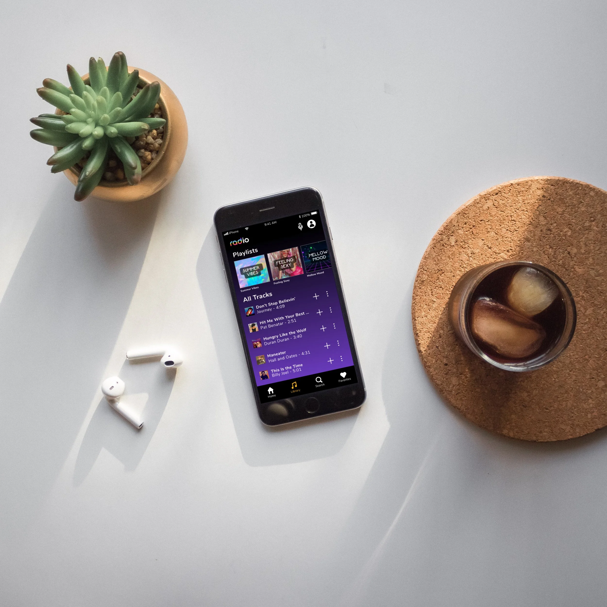
Library and Favorites Screen
Save songs to your personal radio library.
Keep track of your favorite tracks, artists, albums, playlists and downloads.

Fun Fact Modal
Music and trivia lovers can tap the surprise icon to learn an interesting fact about the song or artist playing on radio.

Profile and Notification Screens
Update your profile, email or password settings.
Control the radio notifications you receive on your iPhone.

Mockups


Retrospective
This project was a riot because it allowed me to show my personality through design. It’s bold, bright, playful and creative.
This was one of my first UI projects, so I discovered a lot during the design process, such as navigating and utilizing Adobe XD, shortcuts and design dos and don’ts.
When concocting the design, I decided to put the app in dark mode. However, once the project was complete, I learned that hex code #00000 shouldn’t be used as a background color because it can put strain on the eyes. If I were to do this project again, I would choose a different shade of black or gray to avoid this issue.