Small Change
UI/UX for Android + iOS
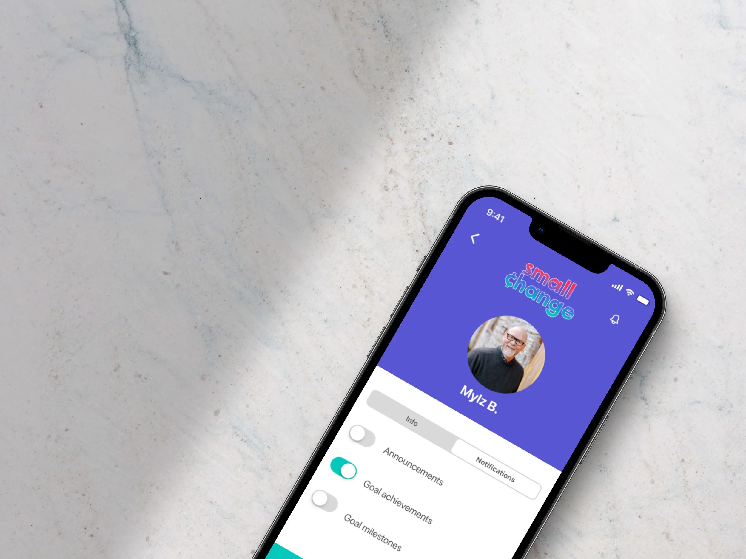
An app that lets you choose where you want your spare change to go. You can designate a different charity at each store.
My Roles: User research, user flows, style guide, wireframes, prototypes and mockups
Tools Used: Figma, Adobe Illustrator, Photoshop, Lucidchart, Mockuuups and Canva
Project Timeline: 2 months
Objective
Design iOS (Human Interface) and Android (Material Design) versions of a native mobile app that solve a unique, specific user problem.
What’s the Big Idea?
Have you ever been asked to donate your spare change to a nonprofit while you're checking out at a store?
Small Change allows you to donate your spare change from specific stores to the nonprofit(s) of your choice.
Research
Competitive Analysis
Acorns
Acorns' design is sleek and modern. The app takes a user on a step-by-step, but lengthy, registration process. The process should be shorter and more intuitive.
Chime
Chime has a quirkier vibe and a simplistic feel. It's a banking app rather than a spare-change app.
Define
Users
Individuals who want to round up their purchases to donate to a good cause.
Nonprofits, schools, churches or other organizations that need to raise money.
Ideate
User Flow: Jobs to Be Done
Sign Up For An Account
User Flow 1: I want to join Small Change so I can designate an organization to receive my donations.
User Flow 1: I want to add my organization to the app's database in order to receive donations.
User Flow 2: I want to choose and donate my spare change to the organization of my choice.
Style Guide
For this project, in terms of color psychology, I wanted to include bold like pink, teal and orange, which exude passion, urgency, charity and action. The name of the app—Small Change—signifies the motto of the company “A little bit goes a long way to make a big difference.” The heart represents the feeling and purpose, while the coin symbol (¢) represents the charitable aspect. The imagery depicts the overall mission and various components of the app. Fonts were standard depending on the design system being used (SF Pro Display for iOS and Roboto for Android).
Prototype + Testing
High-Fidelity Wireframes + Product Highlights
Once the user flows were set up and the first iteration of the high-fidelity wireframes was complete, I created the prototypes for each version (Android and iOS) and asked users to complete the onboarding process for each. Overall, most users considered it intuitive and easy to follow. They found setting up a personal or organizational account straightforward. This was likely due to the fact that I made sure to put each step of the registration process on a separate screen.
Common user comments (and fixes) included:
The nav menu needs to be static.
Fix: Fix the nav menu.I don’t like having to scroll below the fold the view the buttons on the first screens.
Fix: Make adjustments to the grid and tighten space between elements.The instructions are easy to follow.
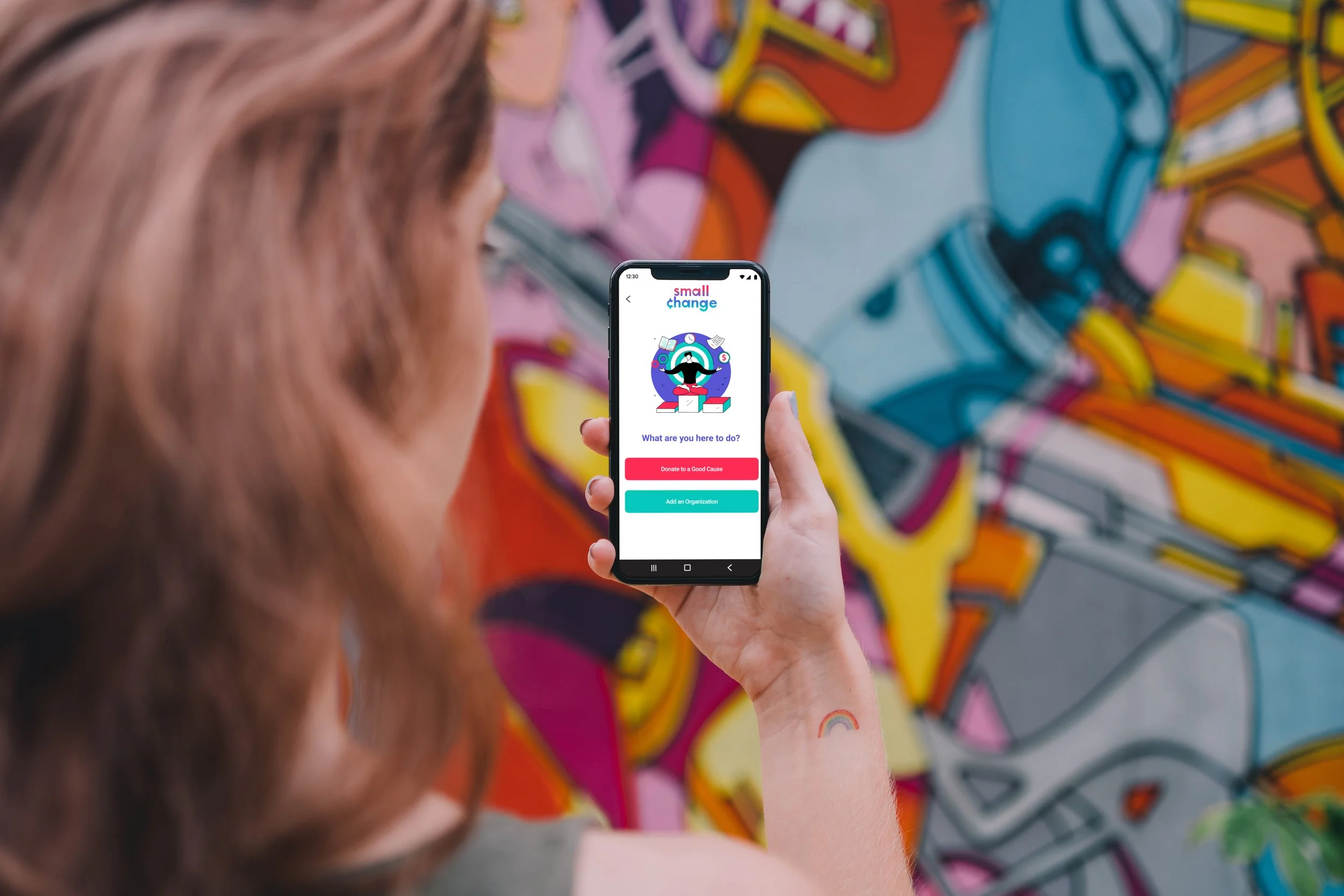
Onboarding Screen
Set Up a Donation
Sign up to donate your spare change to an organization you're passionate about.
Nominate your nonprofit to be added to Small Change's database.
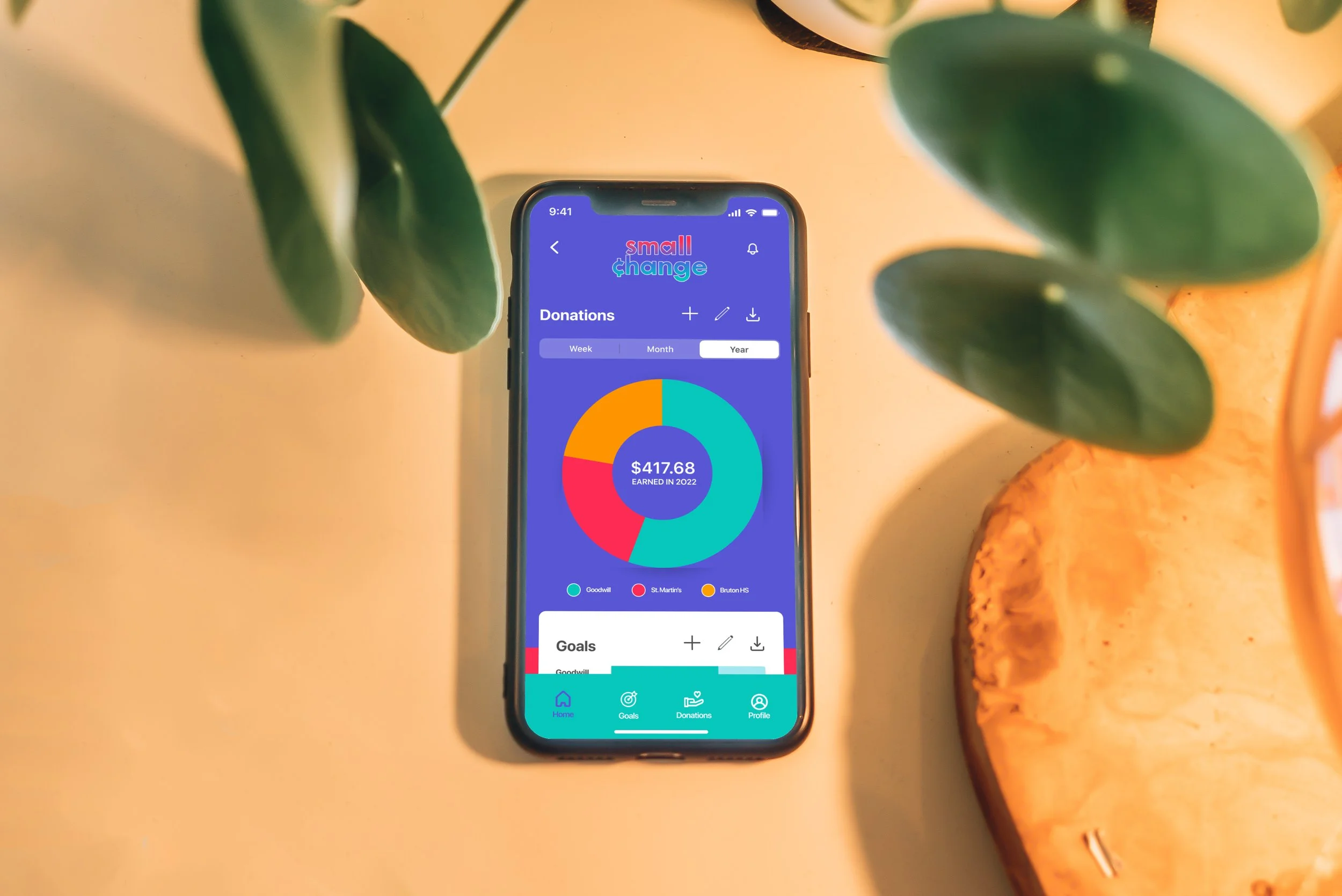
Home Screen Dashboard
View the progress of the donations and goals you set.
Download a PDF to report your donations on your taxes.
Donations Dashboard
Determine where your donations are made based on where you shop.
View which organizations are receiving the most donations.
Goals Dashboard
See how much you've earned and how much remains to achieve a goal that you set.
Learn which Small Change members are earning the most money for a good cause.
View Prototypes
Mockups
Retrospective
My goal was to create an application that was visually bold and appealing, and allowed micro-philanthropists and nonprofit leaders to painlessly set up donations. I believe I achieved this by creating an app that takes users on an easy, step-by-step onboarding process.
In terms of design, the biggest challenge was structuring a screen in a way that it would incorporate text and an illustration without requiring the user to scroll up or down in order to complete a particular step. When it came time to produce mockups, I also needed to reformat and resize the designs to fit a particular phone model.
In the future, I would try to templatize the structure of the design screens so I won't be required to constantly modify the space where the content lives. This will save time and energy.
